Please log in or register. Registered visitors get fewer ads.
Keep The Club Crest !
Sunday, 5th Jun 2011 21:51

The rumour is that Saints are going to change the Club crest, but many feel that this would not be a good news.

Over the years Saints never really had a crest that identified them, early pictures of the team show that by around 1888 they had started to wear the county crest on their shirts and this continued for around 5 -6 seasons, however when the team switched to the red & white stripes they would be synonymous with in 1896 a badge of any kind disapeared from the shirts and would not return for nearly 80 years.

Yes the club had a crest as sorts that appeared in the club programmes etc, a badge taken from th Southampton Borough coat of arms featuring  three tudor roses, but this did not appear on any of our shirts and over the years the famous stripes were always without a badge, no matter what retro shirt manufacturers would like you to believe.

In 1974 though this all changed and version one of our current crest appeared, this was the result of a competition asking supporters to design a badge and so Saints started the season back in Division Two with the new design on their shirts, simply speaking the badge combined several elements of the things that surrounded the club, starting from the top the halo reprsented the club nickname of the Saints, the ball of course the game we play, the scarf the supporters and our club colours, on the body of the badge the tree reprsents the New Forest to the west of the city and under that the sea is depicted to reflect our maritime heritage and under that the tudor rose from the City coat of arms with finally the name of the club.

I feel that this badge not only pays tribute to all aspects of our great club and city but is also a very striking symbol with its combination of both tradition and simplicity, put bluntly its a crest to be proud of and not the fanciful design of a designer trying to capture modern trends as perhaps the design of the AFC Bournemouth badge was.

Version oneof the crest featured a plain football and this survived until around 1996/97 when the club changed the design of the ball to black  spots for copyright reasons..

For the past 37 years this symbol has been worn on our shirts and adorns the skin of many supporters who have had it tattoed on themselves, it is a symbol that having been so prominent on our shirts through some great times and indeed some bad times as well is recognised throughout football from afar.

So why change now ? I agree that in some respects we are going through some changes and indeed that it was a new beginning of sorts in 2009, but this football club was not founded in 2009 it was founded in 1885, players, managers, Chairmen even supporters have come and gone over the past 125 years and they will continue to so so over the next 125, but the one thing that is constant is the football club at the hub of it, in this respect it doesnt belong to any individual but the community as a whole and its its very existence is dependent on the supporters to do just that support the club, something that is easy in the good times and not so in the dark days.

When Markus Liebherr arrived at St Mary's the word from him was that he would be a "good custodian" the word owner was never mentioned, it was always "custodian" with that in mind i would hope that those running the Club will respect our traditions, yes make some new ones, but start those afresh not in place of our old ones.

Saints are in a good period at present, in truth most our recent history has been good barring a few seasons in the past half dozen years and we Saints fans have been lucky in that those of us under 60 have until recently known nothing but good times up until 2005 anyway.

But in the past 15 years i have seen the support for this club and the pride in it grow to a degree that it never had before, ther ehas never been the pride in the club and indeed the City Of Southampton amongst the supporters as there has been now, we have built that pride on things like the club crest, we have been proud to wear it across the World and in some respects its a badge of recognition that marks you out as someone special, I have spoken to complete strangers in places as far apart as Florida, New York, Italy even the Czech Republic, why have we spoken, because one or both of us saw the club crest, this is something I feel supporters of Man Utd must envy us for, they see someone wearing their club shirt or badge and chances are they will both live far apart, for us its almost like a passport.

To change it now would split the supporter base, there will of course be people that would not mind a change, but most I have spoken to want to keep the current crest and to be blunt of those who say they wouldnt mind a change around 90% say they would want us to go back to the three rose crest of old.

As the old saying goes though "If it aint broke dont fix it" change is good but not change for change sake, could you imagine a Liverpool shirt without the Liver Bird, a Arsenal Shirt without the cannon, a West ham Shirt without the hammers even dare i say it a pompey shirt without their symbol, look at all the club crests in the league, all the best ones are the traditional designs, Ok some have been modified slightly over the years but they have maintained the traditional symbols on them, the one that are open to ridicule are those that have as been mentioned previously, been produced by a designer with amodernistic approach with no feel for the club or the City it is meant to represent.

Perhaps thats why ours is so special, it was designed by someone who knew what the club and city was all about, it encompasses everything in it that it needs to, it has served us well for 37 years, it is what identifies us to people the World over, please dont change it !         

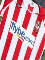
Photo: Action Images


Please report offensive, libellous or inappropriate posts by using the links provided.


steve73 added 00:14 - Jun 6
Couldn't agree more. Our crest isn't the smartest but it's loved by the people that matter. I'm unsure about the motivation behind changing it. A marketing ploy? I can't think of any other reason. So what's the point? Is having a snazzy badge going to attract new supporters? If so they're not the kind we need. Leave it alone!
0

mcguirk added 00:17 - Jun 6
I hope they change it, i've never liked our crest much, it looks messy and badly designed - id prefer it more like the original simpler one, less cluttered. It needs modernising.
0

Kiwifiedpom added 04:53 - Jun 6
I have always thought it was a Disney Cartoon. Of course I remember the time when we had no badge and when we did it was the Corporation Crest and I didn't like that either. But if we do have to have a badge then whether I like it or not then I think we I have to go with the Corporation Crest.
0

st_bangkok added 06:29 - Jun 6
As i said on the forum discussion on the same subject i think we are damn lucky that we have such a unique and well thought our badge not like all those other boring ones that seem to mean nothing.
0

splurty added 07:59 - Jun 6
I agree its very recognisable and makes sense ! So put bluntly please leave it alone ..OH and poopey were coming for you . COYR
0

dirk_doone added 08:56 - Jun 6
The competition to change the club badge in the 1970s was not, as I recall much to do with supporters. We weren't given an opportunity to see the short list and we certainly weren't given the chance to vote on it. I believe local schools got involved and that it was a pupil at one of them who designed the badge. I don't think this meant she was actually a supporter of the club: it was just something she did in her school art class. When the new badge was revealed, all of the fans hated it, and most still do. It lacks gravitas and looks rather silly and childish. It has even won a few silliest badges in football awards in its time. I, like many other fans, hope that we can revert to the three roses.
0

ronniedavies added 09:14 - Jun 6
Time for a change and move forward with a new design.
By far the most popular move would be a return to the three tudor roses which is depicted all around the city on street names to street furniture etc. and is instantly recognisable.
If we could come up with a design which incorporated SFC into this crest than I feel this would give more visual impact.
Failing that why can't they just use the three roses as the focal point in the existing badge and take out the oak tree!....job done.
0

SaintNick added 09:36 - Jun 6
A few observations, between 1896 & 1974 we never had any badge on our shirts so the three roses is not instantly recognisable to anyone bar those who live n the city, in some respects our current badge reflects that not all supporters live in the city.

Secondly the competition was not put out to schools it was open to all and was won by a guy who worked in the docks, whilst like anything there was obviously those that didnt like it, certainly by 1976 when it was beamed across tv screens the world over most loved it.

It seems that not many really want a new crest it seems to be that around 75% want to retain the existing one, 20% want to see a design with the three roses in in and very few actually want a complete change.

Perhaps the answer is as was pointed out, to remove the tree and put in the missing two roses then most would be happy
0

UTS added 09:43 - Jun 6
Its our club and crest and only WE decide if anything changes.

Its only a bullshit wind up rumour anyway.
0

Capt_Koons added 10:00 - Jun 6
You can't build tradition and heritage without continuity. Keep the badge and lets get back to our traditional Red and White Stripes asap.
0

dirk_doone added 10:23 - Jun 6
The 125th anniversary badge is a bit better than the standard one. Use that as the basis. Replace the tree with two red roses and get rid of the scarf and the ball. Keep the waves in the middle, which would make it distinct from the city crest.
0

Tommy2019 added 14:07 - Jun 6
There has been a new start at club in so many ways and Saints are on an exciting upward curve, if we were to change the badge, now would be the perfect time.

In gaining promotion we have achieved the first step in our plan to get back to the Premier League, similarly it feels like every part of the club's ambition and setup has stepped up a league. To take full advantage of this, it may be a good idea to present ourselves in a way that reflects this step up in quality.

The current crest has no real heritage, for the majority of the club's history we've been badgeless. Re-designing the badge to reflect the new ethos of the club doesn't necessarily mean it will change beyond recognition. It can still reference the important elements we already have in there; fans, county rose etc but the exectution could be improved hugely.

Maybe a new badge could be the reason for the late home shirt release?
0

ThereIn76 added 14:34 - Jun 6
I've always thought of the current crest as rather naff. The scarf is supposed to represent supporters' interest, hey there's a novelty! The tree represents the New Forest and the blue wavy lines Southampton Water or the Solent, it's supposed to be a football club badge not a tourist brochure. I agree with what Tommy2019 says. A simpler design keeping the halo, football, rose and Southampton FC inscription would represent our club far better than the current crest which is too busy and too messy.
0

HambleSaint added 14:35 - Jun 6
I would like to see the club badge completely updated and I see nothing wrong with moving with the times. Designers should also not just be seen as some distant figure far removed from the common fan. They are professional after all and although you will never keep everyone happy when things like this change, they do understand how image and marketing promote and reignite products. Football Clubs in my eyes are no different to any other major brand out there; they are all fighting for your attention. Image is important. For me, our current brand / badge, is kind of dull and old. If we are going to look to increase our fan base in the years to come; the results on the pitch obviously come first, but, image can also attract attention and investment.
0

zonehead added 15:22 - Jun 6
I agree the crest does look dated, just a simple football with "the saint " logo is suffice.
0


You need to login in order to post your comments

Blogs 31 bloggers

Knees-up Mother Brown #22 by wessex_exile

Leeds United Polls

About Us Contact Us Terms & Conditions Privacy Cookies Advertising
© FansNetwork 2025